
Chinese Firm Faces Criticism Over Logo Resembling F1
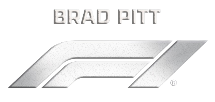
In a world where brand recognition is fiercely guarded, Time Fengjun Entertainment finds itself in the eye of a social media storm. The Chinese entertainment company has been accused by Formula One (F1) enthusiasts of crafting a logo that bears an uncanny resemblance to the globally recognised F1 emblem.
The controversy ignited when eagle-eyed fans took to social media platforms, posting side-by-side images of the two logos. The similarities, they argued, were too striking to be coincidental. While both logos employ sleek lines and a modern aesthetic, the F1 logo's distinctive '1' nestled within a dynamic graphic seemed mirrored in Time Fengjun's design.
Public Backlash and Corporate Silence
The backlash has been swift and vocal. Fans have lambasted the entertainment firm for what they perceive as a blatant infringement on F1's brand identity. Yet, amidst the uproar, Time Fengjun has remained conspicuously silent, offering no public response to the allegations.
This episode serves as a stark reminder of the challenges companies face in maintaining unique brand identities in an era of rapid digital dissemination. With logos being a crucial element of corporate identity, any perceived imitation can lead to reputational damage.
Why It Matters
Brand identity is more than just a logo; it encapsulates a company's ethos, values, and promise. For F1, a brand synonymous with speed, precision, and glamour, any perceived infringement jeopardises its carefully curated image. As businesses increasingly operate on a global stage, the scrutiny on brand originality intensifies.
While the internet enables swift brand recognition, it also accelerates backlash when perceived boundaries are crossed. As of now, the ball is in Time Fengjun's court to either amend the design or clarify its stance. In the absence of a resolution, the debate is likely to continue, fuelled by passionate fans and brand purists alike.